Makula
Harvest MFD
Oraan
CRM (Oraan)
I design real products used by real users, focusing on clarity, accessibility, and business impact, not just visuals.

Proven impact, not just pretty screens
My work has directly improved business metrics including +40% profile conversion, +11% retention, and +8% core flow conversions.
End-to-end product ownership
From discovery and user flows to high-fidelity UI and developer handoff, I’ve owned entire product journeys in real production apps.
Strong systems thinking
I build and maintain scalable design systems, work closely with developers, and design with technical constraints, and reusability in mind.
Accessibility-first, user-focused mindset
I actively design with WCAG accessibility standards, clear content hierarchy, and real user clarity especially for financial products where trust and understanding matter.

Harvest MFD
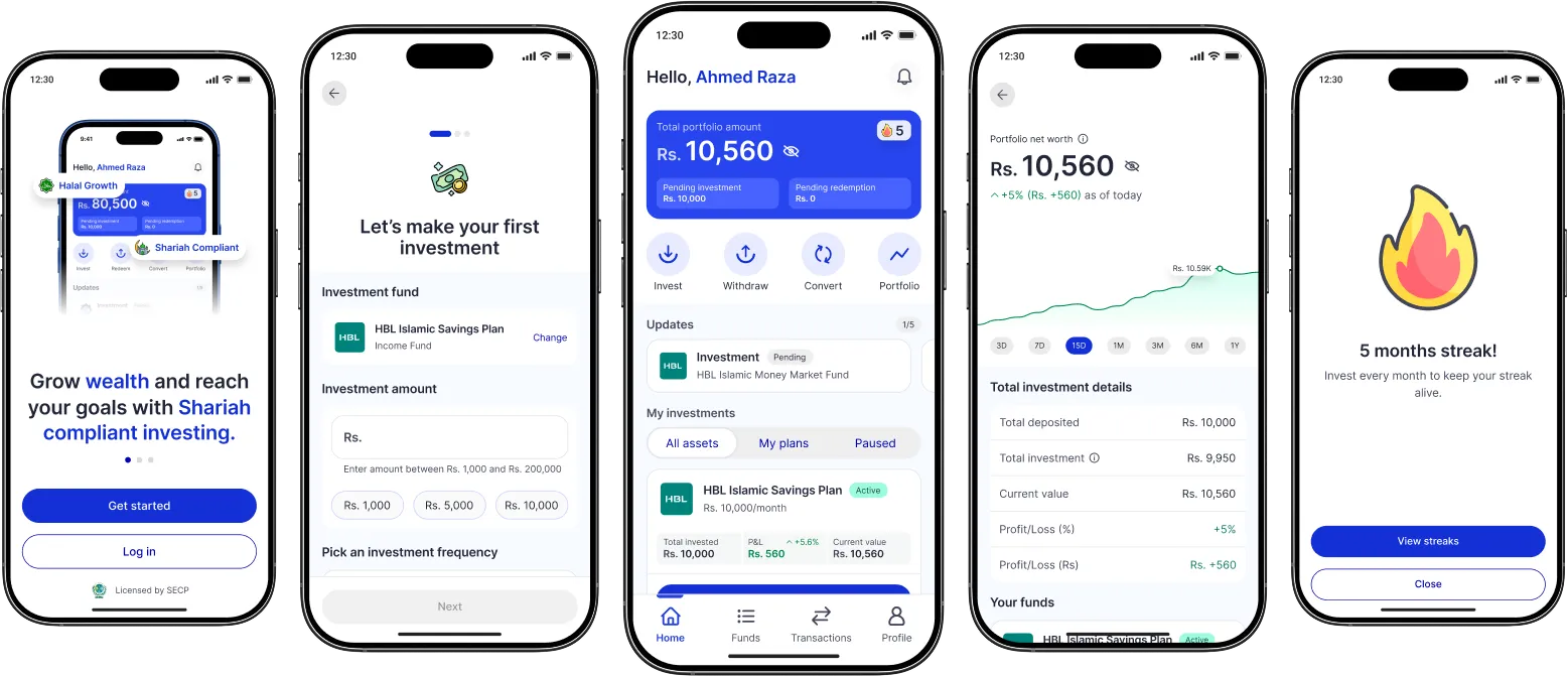
A platform where investing becomes a seamless part of your routine, so you can grow your money steadily without stress.
Role
Product Designer
Team
1 Product Designer
1 Developer
2 Founders
Tools
Figma
Clickup
Timeline
1.5 years
Introduction
When I joined the Harvest MFDs project, one insight stood out: nearly 97% of Pakistanis had never invested in mutual funds. Instead, they relied on informal saving methods like committees, gold, and keeping cash at home. This wasn’t just about financial literacy, it was about trust, accessibility, and confidence.
Our challenge was clear: design an experience that could win trust and guide a first-time investor from curiosity to consistent investing — without overwhelming them, while staying compliant with SECP regulations.
Problem statement
Most salaried individuals in Pakistan want to grow their money, but lack the knowledge, trust, and guidance to invest safely in mutual funds. Religious concerns, fear of scams, and complex onboarding processes create a high barrier to entry.
Objectives
Simplify onboarding flow.
Build trust through transparent, step-by-step guidance.
Encourage repeat investments via behavioral nudges.
Educate users inside the app without overwhelming them.
To truly understand the barriers, I conducted 10 in-depth interviews with people aged 20–40, including researchers, networking professionals, marketers, and business owners. I paired this with secondary research, diving into studies like:
Save More Tomorrow: Using Behavioral Economics to Increase Employee Saving
Mental Accounting: Definition, Avoiding Bias, and Example
The Psychology of Saving Money: Why We Save and Why We Don’t
Key insights:
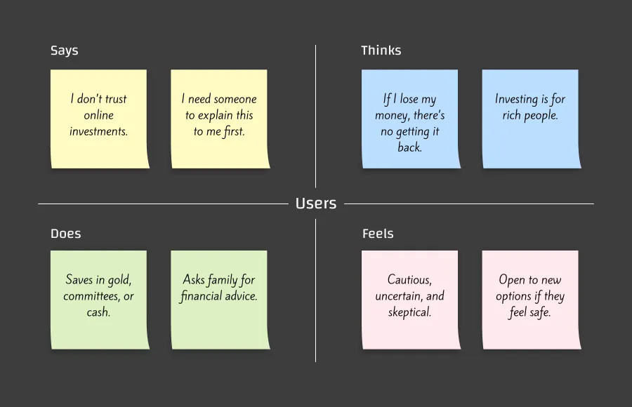
Most had never heard of mutual funds.
Strong reliance on gold or committees for savings.
Preference for very simplified English.
Distrust in financial apps unless there’s a human touch.
Empathy Map
Jobs to Be Done
“When I want to save money, I want a safe and Shariah-compliant way to grow it, so I can feel confident I’m making the right financial choice without risking my savings.”
Key Questions to Guide the Design
How might we help a user understand mutual funds in under 2 minutes?
How might we create a sense of progress without overwhelming them with KYC forms?
How might we ensure every interaction feels trustworthy and transparent?
From the research, I framed the problem as:
“Salaried individuals in Pakistan want to save and grow their money, but don’t know how to invest safely and consistently in mutual funds.”
This led to our design challenge:
How might we educate and guide first-time users so they can make their first investment confidently and continue investing regularly?
In early brainstorming sessions, I explored:
Linear onboarding with milestone-based modules to break the KYC process into digestible steps.
Behavioral nudges like streaks to encourage repeat investments.
Discover Tab to deliver mutual fund education and app tutorials in short, story-like formats.
Delight screens to reward user progress and reinforce trust.
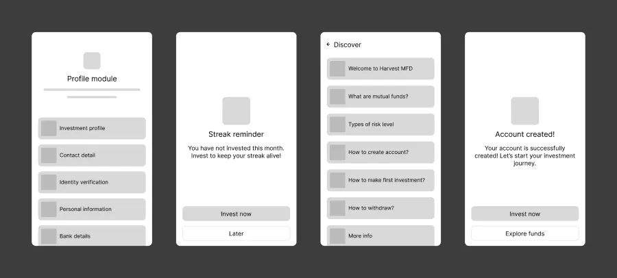
I mapped out multiple UX flows, compared trade-offs, and validated them internally before moving to design.
I designed a complete component library from scratch, referencing Google Material 3 for structure but creating a custom color palette to reflect trust, growth, and accessibility.
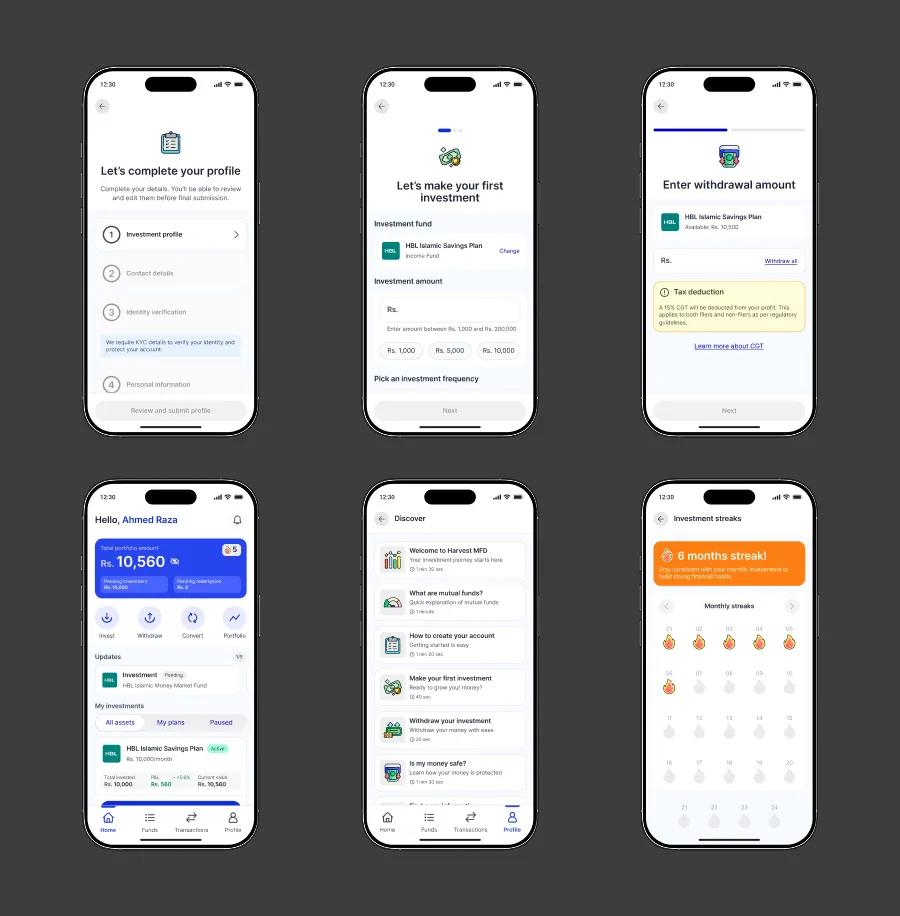
Final Experience Highlights:
I designed a complete component library from scratch, referencing Google Material 3 for structure but creating a custom color palette to reflect trust, growth, and accessibility.
6-Module Profile Completion: Step-by-step KYC, reducing overwhelm and increasing completion rates.
Investment Flow: 3-step process with proof upload, kept simple for first-time investors.
Withdrawal Flow: Transparent CGT disclosure + OTP verification for security.
Dashboard: Clear status view, quick invest/redeem actions, and streaks for habit tracking.
Discover Tab: App usage and mutual fund education in bite-sized, story-like cards.
Streaks: Recognizing consistent investors and reinforcing positive behavior.
Collaboration was key. I worked closely with:
Developers: Ensuring pixel-perfect implementation and smooth interaction states.
QA: Testing for edge cases and language clarity.
Marketing: Aligning Discover Tab content with educational goals.
Tools: Figm and ClickUp.
We ran user testing on the MVP, then iterated on the entire app experience.
Breaking profile completion into smaller modules improved completion by 40%.
Simplified language and inline helper text removed confusion.
Streak system boosted monthly reinvestment by 11%.
One key improvement:
Manual identity verification (with clear instructions) now performs 40% better than our old automatic verification via a 3rd-party provider.
This project was more than just designing screens — it was about translating complex financial concepts into a simple, trustworthy experience for first-time investors in Pakistan. It taught me the value of empathy-driven design in markets where trust is the real currency.
Role
Product Designer
Team
2 Product Designers
2 Developers
2 Project Managers
1 Founders
Tools
Figma
Figjam
Jira
Google meet
Timeline
Aug 2023 - Oct 2024
Full time
Introduction
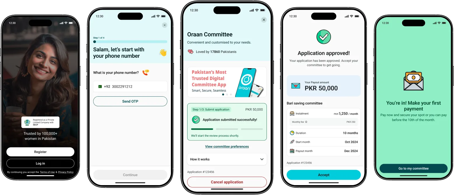
Oraan was born out of a shared frustration. We saw women being left out of the traditional banking system, facing hurdles in opening bank accounts, applying for credit cards, or securing loans. We knew we weren’t alone—millions of women across Pakistan were experiencing the same roadblocks to financial inclusion and mobility. That’s when we decided to take matters into our own hands and create a platform that empowers women and their households financially.
The committee application flow sits at the heart of Oraan. It’s where users start their savings journey. However, the process was long, confusing, and often abandoned midway. To tackle this, I collaborated with IDEO, a global design and innovation company, to rethink the experience from the ground up.
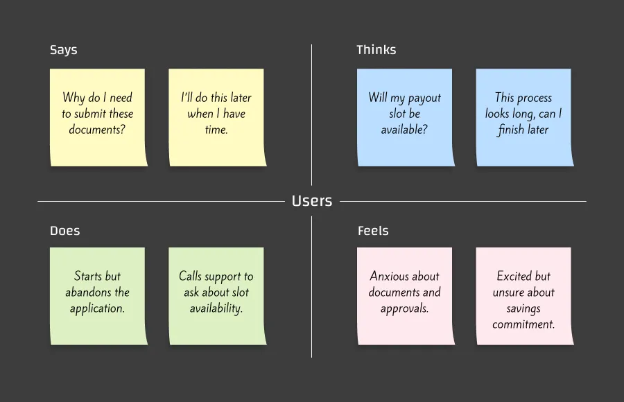
Working alongside IDEO, I began with research to uncover the core pain points. We interviewed users, observed behaviors, and mapped frustrations. It became clear that the current flow overwhelmed people. Users often started but didn’t finish, or changed their minds after seeing unavailable payout slots. The need for documents like CNIC and bank statements further discouraged them.
We visualized this through empathy maps:
This phase grounded us in the user’s reality and helped prioritize what mattered most—clarity, simplicity, and trust.
Empathy Map
With IDEO, I held co-design sessions and brainstorming workshops. Our focus was on making the process shorter, clearer, and more intuitive. We explored:
How to simplify payout slot selection by showing clear availability and benefits without overwhelming the user.
Ways to merge steps so that users wouldn’t need to scroll or switch screens excessively.
Flows that could adapt for both first-time users and repeat users without friction.
I sketched multiple variations and refined them into concepts that balanced transparency with simplicity.
Once we had clear concepts, I translated them into tangible designs. The new flow was built around a few key principles:
Simplify upfront decisions: Instalment amount, duration, start month, and payout slot selection were merged into a smoother sequence.
Clarify slot availability: Instead of vague labels, each slot clearly indicated fees, documents required, or if it was free.
Transparent review: A clean review screen allowed users to check all details before submitting.
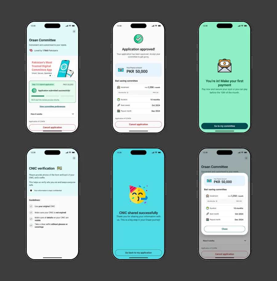
Alongside the flow, I refined the UX copy, adding short, friendly alerts and explanations to guide users step by step. Wireframes evolved into high-fidelity prototypes, ensuring visual and interaction consistency.
I collaborated closely with the development team to hand over the designs. By using modular components and a clear design system, we reduced design-to-development time by 45%. The streamlined framework also made it easier to adapt flows for both new and repeat users, saving future effort.
I validated the new designs through usability testing. Users responded positively to the simplified steps and clearer slot information. However, testing revealed areas to refine:
Slot explanations needed to be even more concise (“No fee slots,” “Requires documents”).
Users preferred fewer back-and-forth screens, so we condensed interactions further.
I iterated quickly, testing again before final rollout. Post-launch data showed a significant improvement. Conversion rates increased by 8%, and support queries around payout slots decreased.
Results
The redesigned committee application flow made the experience simpler, faster, and more transparent. By focusing on what users cared about (clarity of slots and ease of approval) we increased their confidence to start a committee.
Impact
Reduced design-development time by 45%.
Improved conversion by 8%.
Built a flexible flow for both new and repeat users.
Most importantly, the collaboration with IDEO allowed me to bring world-class UX practices into Oraan, while keeping the design deeply rooted in the needs of Pakistani users.
CRM (Oraan)
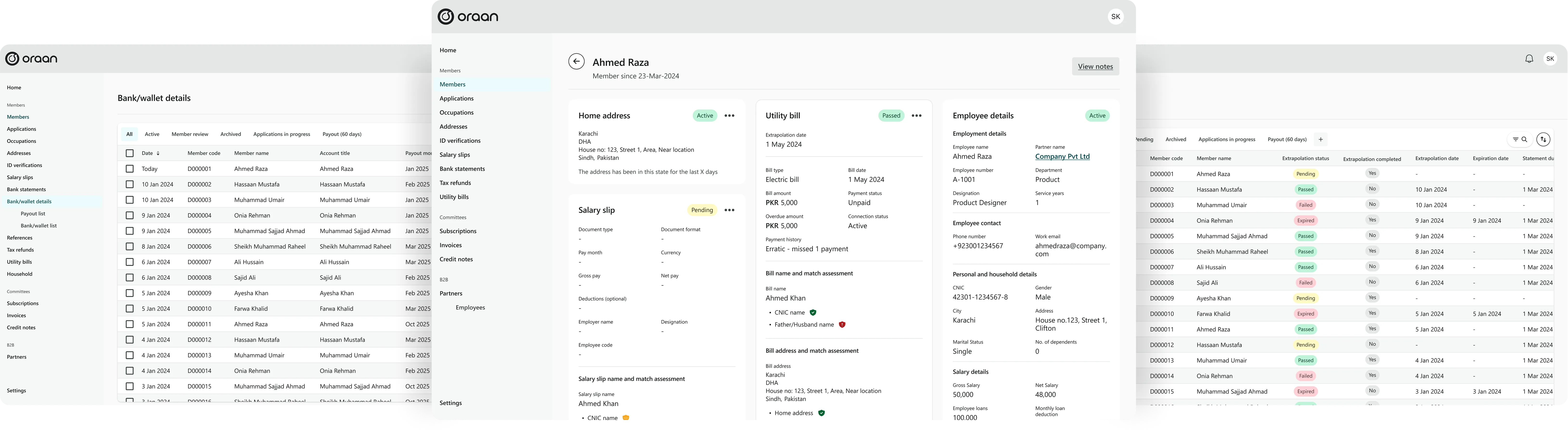
Centralized CRM to replace fragmented manual processes.
Role
Product Designer
Team
2 Product Designers
2 Developers
2 Project Managers
1 Founders
Tools
Figma
Figjam
Jira
Google meet
Timeline
Aug 2023 - Oct 2024
Full time
Introduction
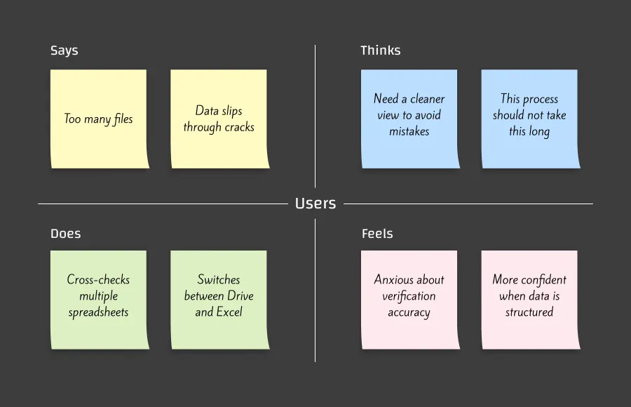
Before the CRM, Oraan’s operations relied heavily on Excel sheets, WhatsApp messages, scattered Google Drive folders, and manual data stitching. As the user base grew, these methods created bottlenecks, delays, and inconsistent record keeping. Agents struggled to find the right documents, leads lacked visibility, and verification accuracy suffered due to constant context switching.
To solve these challenges, I set out to design a CRM that would not only organize data but fundamentally transform how the team works. The core goal was to reduce operational friction and make every workflow fast, intuitive, and error-free.
I conducted user interviews with 13 internal team members (Ops agents, verification specialists, and supervisors). The goal was to understand their day-to-day workflows, pain points, and mental models. These conversations revealed a strong desire for structure, speed, and better visibility across the organization. Teams frequently mentioned losing time due to searching, cross-checking, and switching apps. Verification alone often took up to 40–60% longer than necessary due to scattered data sources.
Key Insights
Information fragmentation caused delays and errors
Agents wanted to reduce back-and-forth between documents
Verification required a single, reliable source of truth
Team leads needed high-level visibility and activity history
Empathy Map
Through collaborative workshops with Ops and Verification teams, I explored multiple directions for structuring the CRM. Early wireframes focused on simplifying tables, creating reusable modules, and ensuring that every critical task could be completed in fewer clicks.
Explored Concepts
Document viewer with quick switching
Bulk import/export with error reporting
Filters for large datasets (occupation, status, date, KYC stage)
Side panels for notes, history, and user activity
Multi-step verification flows with validation
Permission-based roles for secure data access
With clarity on user needs, I built the CRM’s UI and patterns using a custom design system inspired by Shopify Polaris. Consistency, readability, and modularity were essential because the CRM needed to scale rapidly and remain maintainable.
Design System Highlights
Custom color palette with accessibility consideration
Table patterns
Action buttons, tags, chips, dropdowns
Form components with strict validation
Upload modules and status components
Permission-aware states for sensitive data
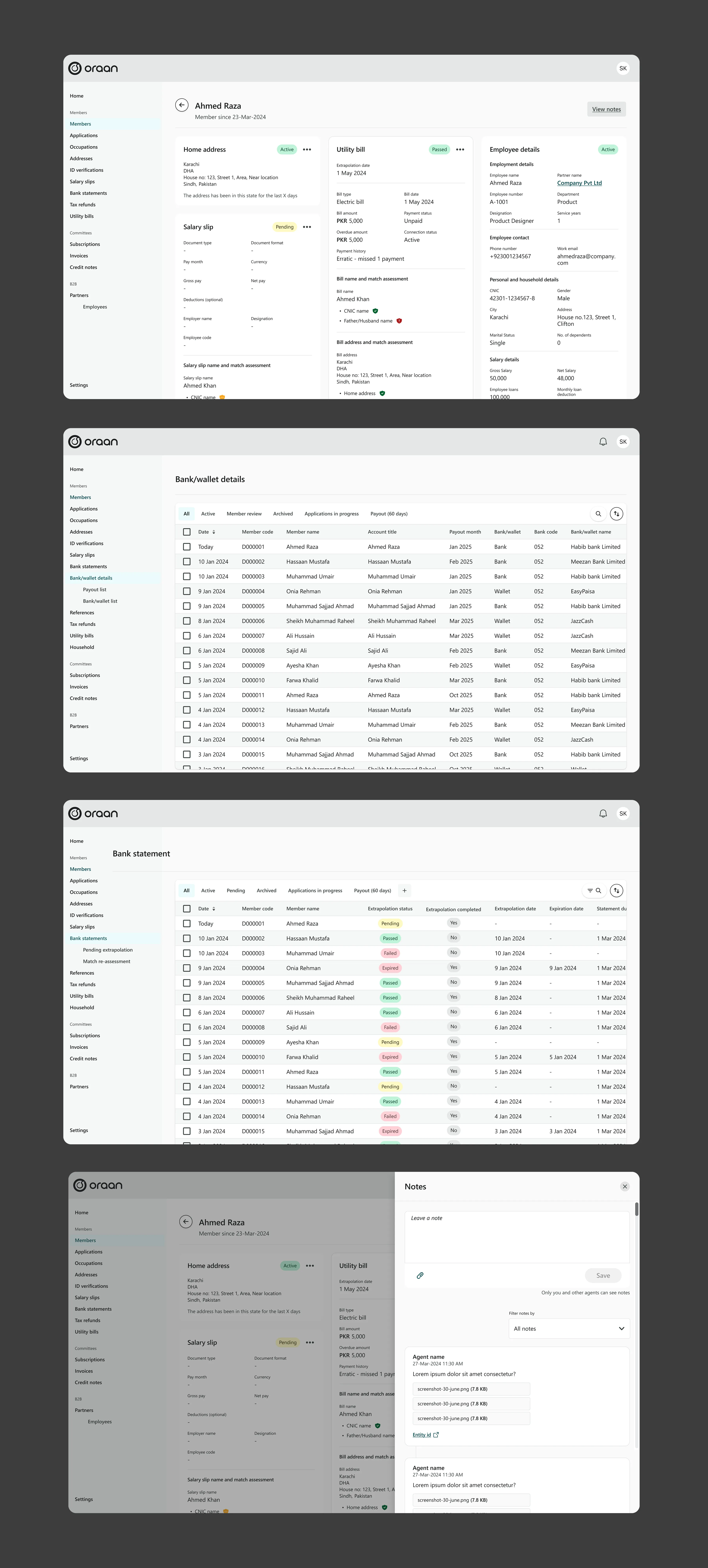
I partnered closely with engineering, Ops leads, and QA to ensure every interaction matched operational needs.
Cross-team Collaboration
Engineering: Component specs, interaction patterns, and edge cases
Ops: Weekly feedback loops to refine workflows
QA: Scenario mapping for document errors and status transitions
Internal testing with agents helped validate assumptions and uncover new needs. By observing real workflows, I optimized the interactions to reduce unnecessary steps.
Reduced clicks using inline table actions
Clarified error messages for bulk import
Added side-panel notes instead of page-level sections
These iterations resulted in smoother flows and increased agent satisfaction.
Results
The CRM had a measurable impact almost immediately after launch.
Operational Improvements
50% boost in agent productivity
40% faster manual identity verification
60% reduction in manual data entry tasks
All data centralized — no more conflicting Excel sheets
Significant decrease in cross-team miscommunication
Higher accuracy and fewer failed verifications
The CRM became the single source of truth for all customer operations — eliminating fragmentation once and for all.
Makula
Makula is a field service management platform built for machinery manufacturers and distributors.
Role
Product Designer
Team
1 Product Designer
1 Founders
Tools
Figma
Claude
Timeline
On going
Introduction
Makula is a field service management platform that helps machinery manufacturers and distributors manage their service operations, including work orders, tickets, assets and customer interactions.
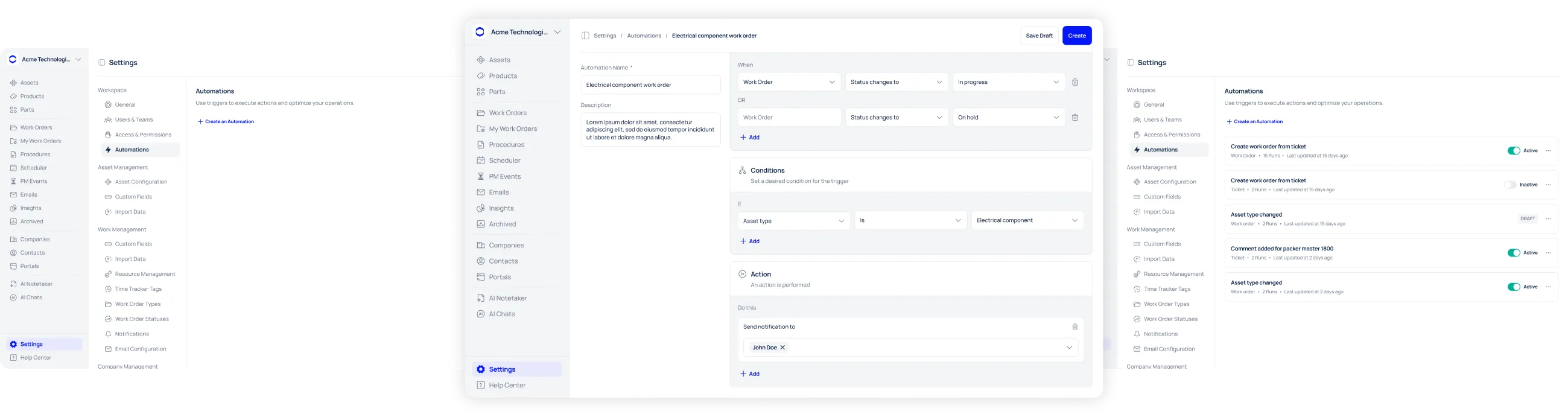
As part of the product team, I worked on designing an Automation Engine to help service teams automate repetitive workflows and reduce the need for manual follow-ups.
Problem statement
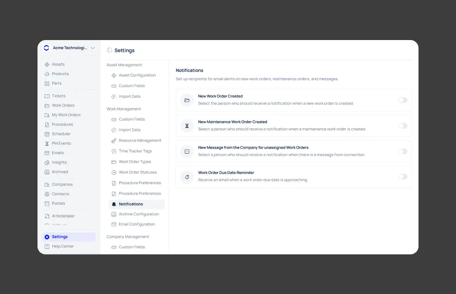
Makula's existing notification system supported only a few predefined events. Teams still had to manually monitor work, follow up on overdue jobs, notify customers and create related records. The opportunity was to move beyond simple notifications and create a flexible Trigger → Condition → Action system that would allow administrators to build their own workflows — while staying aligned with the product's existing capabilities.
Since the automation engine was being designed for an existing product, I started by understanding how Makula currently handles notifications, Work Orders and Tickets.
I reviewed:
Existing notification settings
Work Order details and status behavior
Work Order creation
Ticket creation
Customer portal notifications
Available and required fields
Existing recipient and assignment mechanics
This helped identify the real product constraints that would shape the automation experience.
Defining the automation model
The research helped narrow the problem into one key question:
How might we allow administrators to build conditional workflows themselves without making automation feel like a developer tool?
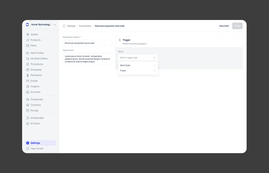
I defined a simple three-part model:
Trigger → Condition → Action
Trigger: When something happens
Condition: Only when something is true
Action: Then do something
The model could then be applied consistently across both Work Orders and Tickets.
Working within product constraints
The automation model needed to reflect what Makula already supported.
For example, Work Orders and Tickets have different fields and relationships, so the builder needed to surface only options relevant to the selected object.
This created a more reliable experience while preventing users from configuring automations around data the product couldn't support.
Exploring the right interaction model
Before finalizing the builder, I explored several questions around how administrators should construct their workflows:
How should internal and customer notifications be handled?
How should multiple conditions work together?
Which actions should be available for different objects?
How should users discover functionality that isn't available yet?
How can complex workflows remain understandable?
The goal was to keep the experience flexible without introducing unnecessary complexity.
From notifications to automations
The existing product already gave users a familiar notification model.
Rather than introducing a completely unfamiliar system, I extended that mental model into:
Something happens → Check conditions → Take action
This became the foundation for the automation builder.
Building the automation
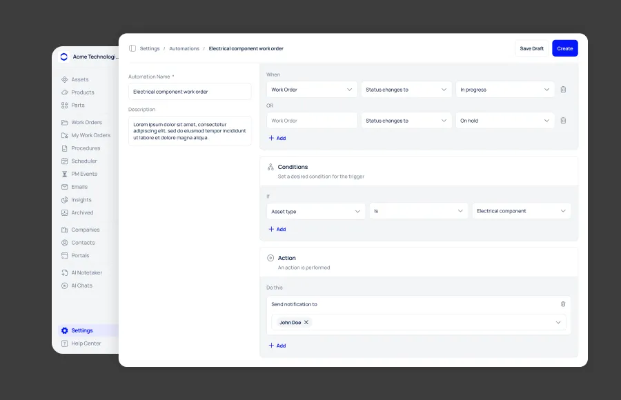
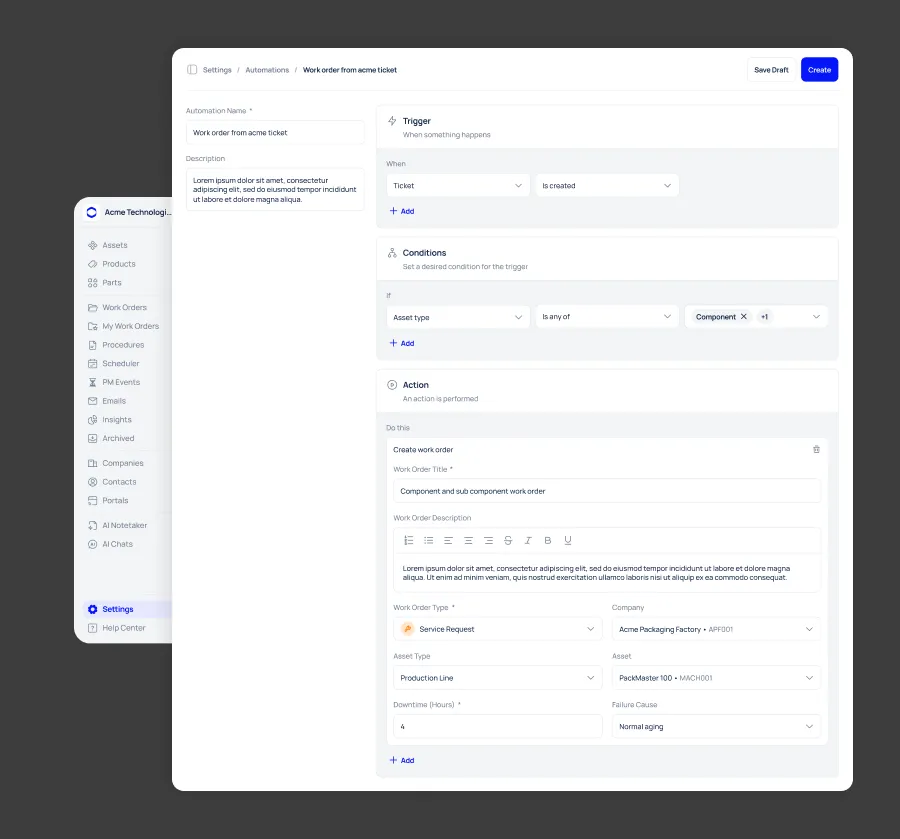
The final builder uses dependent selections for each Trigger, Condition and Action.
The available options adapt to the selected object, while multiple triggers, conditions and actions can be combined to support more complex workflows.
Designing for missing capabilities
A flexible automation system will naturally encounter use cases that aren't supported yet.
Instead of forcing users to leave the builder to request new functionality, I designed Suggest an automation directly within the workflow.
Users can suggest a missing:
Trigger · Condition · Action
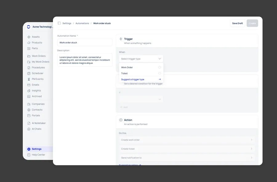
This creates a direct feedback loop between real customer needs and the future automation roadmap.
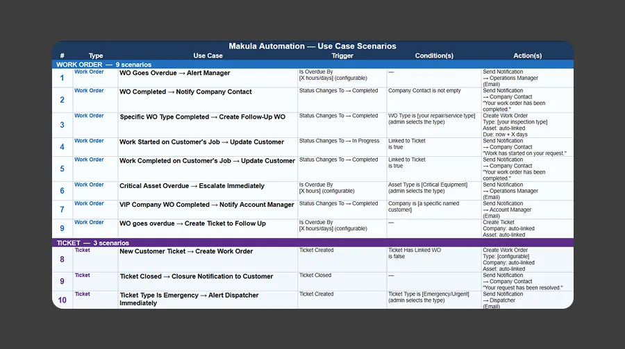
Validating real scenarios
I tested the automation model against a catalog of concrete use cases covering both Work Orders and Tickets.
This helped validate whether each scenario could be represented using the available triggers, conditions and actions, while keeping the experience consistent across both objects.
The process also helped refine the automation model and identify opportunities for future capabilities.
Key takeaway
Designing automation isn't just about adding more options. It's about creating a system that is powerful enough for complex workflows while remaining understandable, reliable and grounded in the real product.
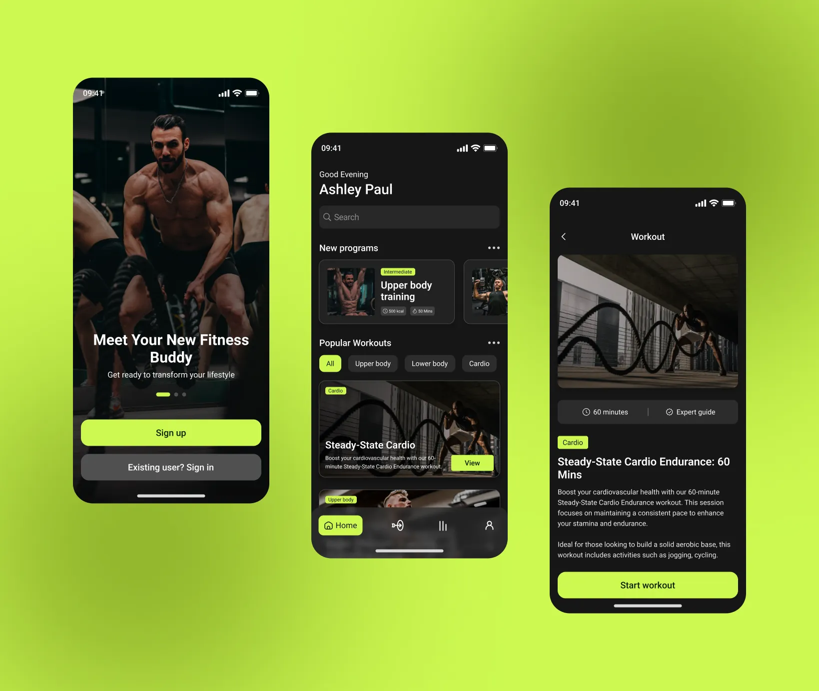
Lorem ipsum dolor sit amet, consectetur adipiscing elit. Suspendisse varius enim in eros elementum tristique. Duis cursus, mi quis viverra ornare, eros dolor interdum nulla, ut commodo diam libero vitae erat. Aenean faucibus nibh et justo cursus id rutrum lorem imperdiet. Nunc ut sem vitae risus tristique posuere.
Lorem ipsum dolor sit amet, consectetur adipiscing elit. Suspendisse varius enim in eros elementum tristique. Duis cursus, mi quis viverra ornare, eros dolor interdum nulla, ut commodo diam libero vitae erat. Aenean faucibus nibh et justo cursus id rutrum lorem imperdiet. Nunc ut sem vitae risus tristique posuere.
Lorem ipsum dolor sit amet, consectetur adipiscing elit. Suspendisse varius enim in eros elementum tristique. Duis cursus, mi quis viverra ornare, eros dolor interdum nulla, ut commodo diam libero vitae erat. Aenean faucibus nibh et justo cursus id rutrum lorem imperdiet. Nunc ut sem vitae risus tristique posuere.
Lorem ipsum dolor sit amet, consectetur adipiscing elit. Suspendisse varius enim in eros elementum tristique. Duis cursus, mi quis viverra ornare, eros dolor interdum nulla, ut commodo diam libero vitae erat. Aenean faucibus nibh et justo cursus id rutrum lorem imperdiet. Nunc ut sem vitae risus tristique posuere.